Example 1 - Plot power spectra
The Bouligand et al. (2009) model describes the radially averaged power spectrum of a magnetic anomaly produced by a fractally magnetised layer:
Four parameters: the depth to the top of the source \(z_t\), its thickness \(\Delta z\), the fractal parameter of the magnetisation \(\beta\), and a constant \(C\) setting the level. The Curie depth is \(z_t + \Delta z\).
This notebook builds intuition for what each parameter does to the spectrum, and then checks that a real spectrum computed from gridded data looks like the analytic one.
Contents
import numpy as np
import matplotlib.pyplot as plt
%matplotlib inline

import pycurious
What each parameter does
pycurious.bouligand2009 evaluates equation (1) directly. Varying one parameter at a time shows which part of the spectrum each controls, which is worth knowing before trying to fit them.
The curves below are offset vertically so their shapes can be compared; \(C\) only slides a curve up or down.
k = np.linspace(1e-3, 3, 10000)
beta, zt, dz, C = 3.0, 1.0, 20.0, 0.0

fig, (ax1, ax2, ax3) = plt.subplots(1, 3, figsize=(15, 5))

for zti in np.arange(0.0, 2.5, 0.5):
    Phi = pycurious.bouligand2009(k, beta, zti, dz, C)
    ax1.semilogx(k, Phi - Phi.max(), label=r'$z_t$ = {} km'.format(zti))

for dzi in [10., 20., 50., 100., 200.]:
    Phi = pycurious.bouligand2009(k, beta, zt, dzi, C)
    ax2.semilogx(k, Phi - Phi.min(), label=r'$\Delta z$ = {} km'.format(dzi))

for betai in np.arange(0, 5, 1):
    Phi = pycurious.bouligand2009(k, betai, zt, dz, C)
    ax3.semilogx(k, Phi - Phi[-1], label=r'$\beta$ = {}'.format(betai))

ax1.set_ylim(-20, 0)
ax2.set_ylim(0, 20)
for ax in (ax1, ax2, ax3):
    ax.set_xlabel(r'$|k|$ [rad km$^{-1}$]')
    ax.legend()
ax1.set_ylabel(r'$\ln \Phi_{\Delta T}$ (offset)')
plt.show()
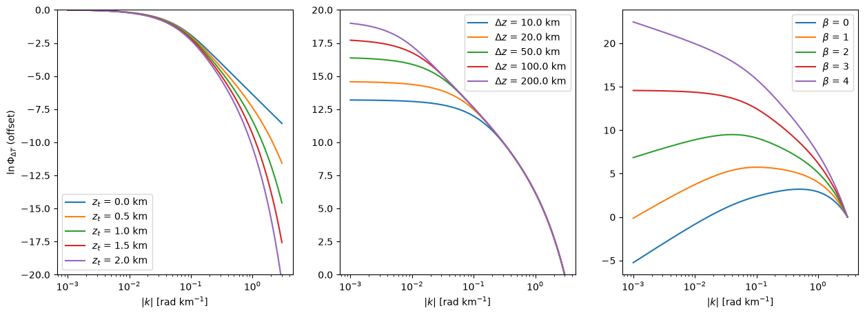
Reading these left to right:
\(z_t\) sets the slope at short wavelengths, on the right. A deeper top attenuates the high wavenumbers more steeply, through the \(-2|k|z_t\) term.
\(\Delta z\) acts only at long wavelengths, on the left, and its effect saturates: 100 km and 200 km are nearly indistinguishable. A layer thicker than the longest wavelength a window resolves looks the same as one thicker still, which is why \(\Delta z\) is the hardest of the four to pin down.
\(\beta\) tilts the whole curve, through the \(-(\beta-1)\ln|k|\) term. It is constrained across the entire spectrum rather than at one end.
That difference matters when fitting: \(\beta\) and \(z_t\) are determined by the bulk of the data, while \(\Delta z\) rests on a handful of the longest-wavelength bins.
A spectrum from gridded data
pycurious.fractal_anomaly synthesises an anomaly whose expected spectrum is equation (1) for parameters of our choosing, so the measured spectrum can be compared against the model it was built from.
beta_true, zt_true, dz_true = 3.0, 1.0, 20.0

data, extent = pycurious.fractal_anomaly(
    n=512, dx=2.0, beta=beta_true, zt=zt_true, dz=dz_true, C=5.0, seed=1)

grid = pycurious.CurieGrid(data, *extent)

xpt = 0.5*(extent[0] + extent[1])
ypt = 0.5*(extent[2] + extent[3])
window_size = 1000e3
fig, ax = plt.subplots(figsize=(7, 6))
im = ax.imshow(data, extent=np.array(extent)*1e-3, cmap='RdBu_r', origin='lower')
ax.set_xlabel('easting [km]')
ax.set_ylabel('northing [km]')
fig.colorbar(im, ax=ax, label='nT')
plt.show()
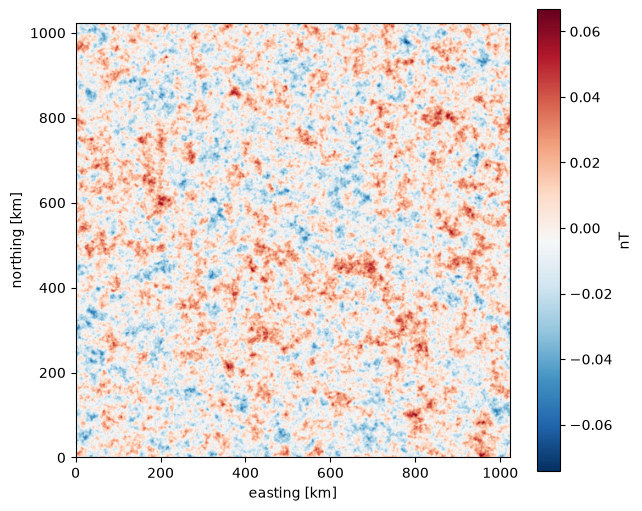
window_spectrum takes a square window, computes the radially averaged spectrum and returns the uncertainty of each binned value. power=2 gives \(\ln \Phi_{\Delta T}\), which is what equation (1) describes; power=1 would give the log amplitude spectrum that the Tanaka method works with instead.
The analytic curve is drawn with the parameters the field was generated from. Its level \(C\) is not recoverable — it absorbs the log-averaging of the spectrum and the power a taper removes — so it is matched to the data here rather than taken from the generator.
k, Phi, sigma_Phi = grid.window_spectrum(
    window_size, xpt, ypt, taper=np.hanning, power=2.0)

model = pycurious.bouligand2009(k, beta_true, zt_true, dz_true, 0.0)
model += (Phi - model).mean()

fig, ax = plt.subplots(figsize=(9, 6))
ax.errorbar(k, Phi, yerr=sigma_Phi, fmt='o', ms=3, elinewidth=0.8,
            label='measured')
ax.plot(k, model, 'r-', lw=2, label='analytic, true parameters')
ax.set_xlabel(r'$|k|$ [rad km$^{-1}$]')
ax.set_ylabel(r'$\ln \Phi_{\Delta T}$')
ax.legend()
plt.show()

residual = Phi - model
print("rms departure from the model: {:.3f} log units".format(residual.std()))
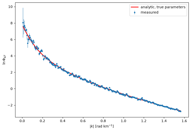
rms departure from the model: 0.143 log units
The measured spectrum scatters about the model rather than lying on it, because this is one random realisation of a fractal field rather than an average over many. That scatter is the reason a fit returns a range rather than a value, and Ex2 turns it into an uncertainty on the Curie depth.
Note the error bars grow towards the left. Each point is the mean over an annulus in the wavenumber plane, and the innermost annuli contain only a handful of cells, so their means are the least well determined. Those are also the points that carry the information about \(\Delta z\).
Choice of taper
A window cuts the field off abruptly at its edges, and that discontinuity leaks power across the spectrum. A taper rolls the data down to zero instead.
fig, ax = plt.subplots(figsize=(9, 6))

for label, taper in [('none', None), ('hanning', np.hanning), ('hamming', np.hamming)]:
    ki, Phii, _ = grid.window_spectrum(window_size, xpt, ypt, taper=taper, power=2.0)
    ax.plot(ki, Phii, '-o', ms=3, label=label)

ax.set_xlabel(r'$|k|$ [rad km$^{-1}$]')
ax.set_ylabel(r'$\ln \Phi_{\Delta T}$')
ax.legend()
plt.show()
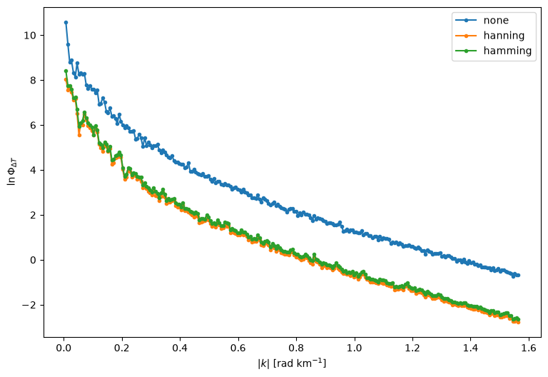
Tapering costs a constant offset in level, absorbed by \(C\), and changes the shape a little at the shortest wavelengths where the leaked power was worst.
It is worth tapering even so, because an untapered fit is measurably biased. Over 120 independent realisations of this synthetic it returns \(\beta = 3.057\) against a true 3.0 and \(z_t = 0.945\) against a true 1.0 — about a standard deviation out in each, in the same direction every time. With np.hanning the same fits give 3.003 and 1.001.
The cost is that a taper correlates neighbouring bins of the spectrum with each other, which has to be accounted for when forming the uncertainties; see Ex3.
References
Bouligand, C., Glen, J. M. G., & Blakely, R. J. (2009). Mapping Curie temperature depth in the western United States with a fractal model for crustal magnetization. Journal of Geophysical Research, 114, B11104. doi:10.1029/2009JB006494